Friends of Duncan Library's Giving Dashboard
Improving financial forecasting by uniting fundraising data in an intuitive dashboard.
Timeline: 3 months
Role: UX Researcher/UX Designer
Tools: Figma, UXTweak, Miro

Friends of Duncan Library's Giving Dashboard
Improving financial forecasting by uniting fundraising data in an intuitive dashboard.
Timeline: 3 months
Role: UX Researcher/UX Designer
Tools: Figma, UXTweak, Miro
Overview
Friends of Duncan Library (FoDL) supplements the library’s city-supported budget. The money FoDL gives to the library supports book purchases and special events that otherwise wouldn't exist. FoDL raises funds primarily through membership campaigns and book sales and tracks that data to be able to forecast what it can support each quarter.
Role and Impact: I was the sole designer exploring how the FoDL board could manage memberships, donors, and financial planning in one place. By simplifying language and aligning flows with users' mental models, I improved users' ability to get current financial information and plan their budgets.
Problem Statement: FoDL needed a single tool that could be used by library volunteers and board members to manage member and donor records and get accurate fundraising information. The tool had to be responsive, require minimal onboarding, and be simple to use for retiree volunteers and the board treasurer.

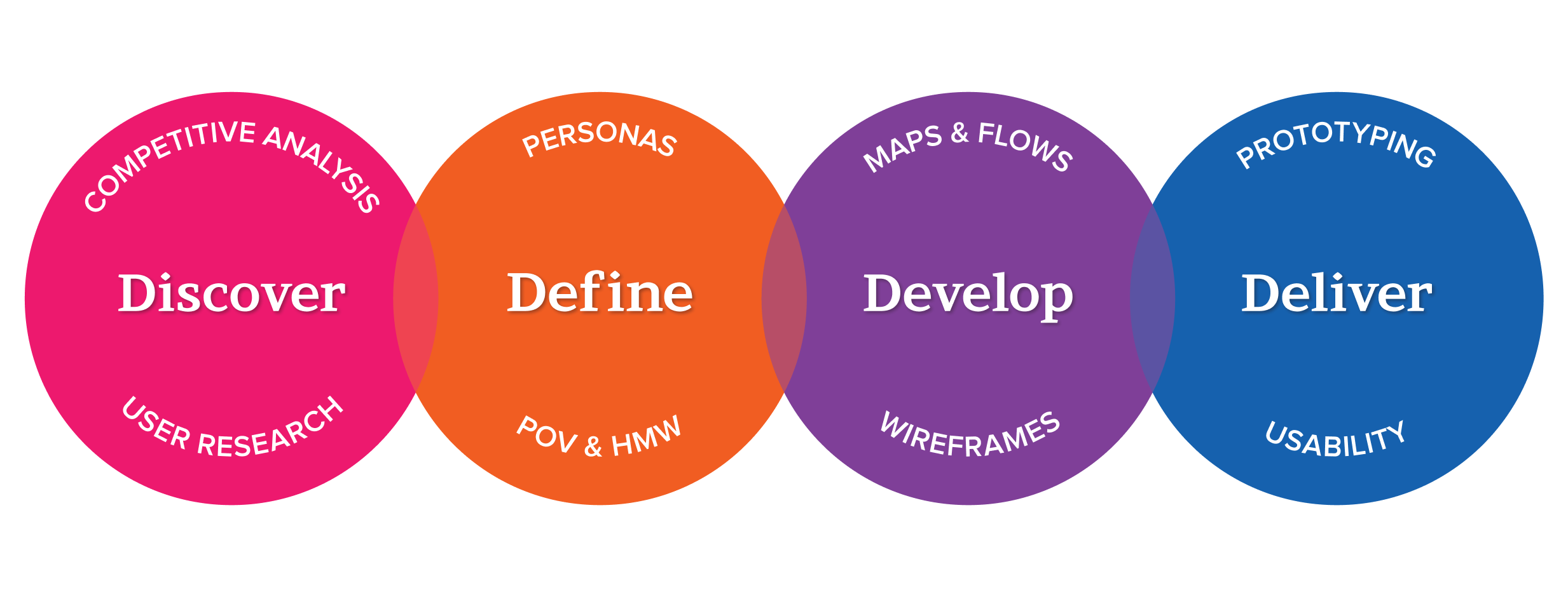
My process is simple and methodical.
I dove into user research to surface all of the board's needs and pain points. I also conducted competitive analysis to find the strengths and shortcomings of dashboards on the market. Then, I gathered and synthesized the data into actionable insights that informed the next stage of the process.
Customer Research Results
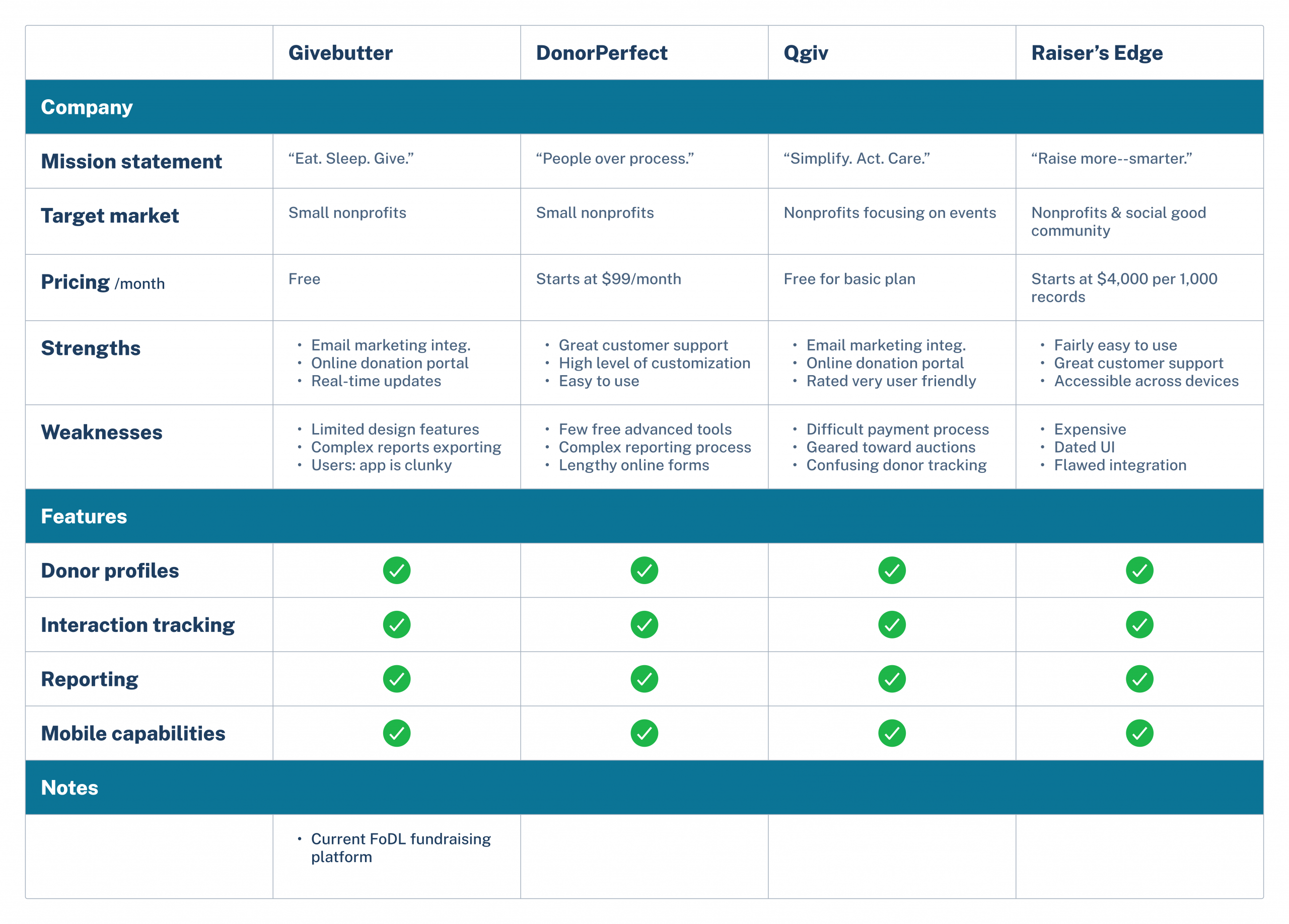
I researched dashboards designed to serve small nonprofits to identify competitor systems and their capabilities.
Users complained about complex reporting, lengthy onboarding, confusing donor tracking, and clunky integrations.
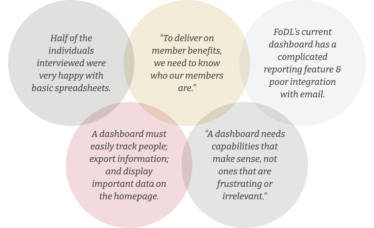
I also talked to 5 adults who volunteer for small nonprofits, three of whom were from FoDL. I asked them about how they track memberships, donations, and supporters and what pain points they experience in the process.
My Findings
Synthesis
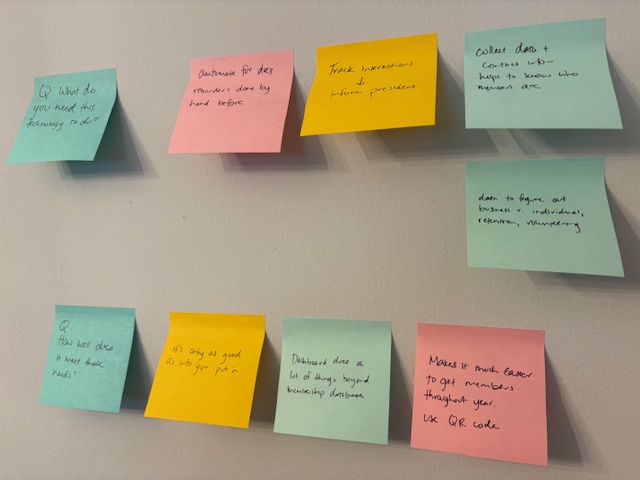
I uploaded the data gathered from user interviews into Miro and began looking for common themes.
From the themes I gathered, I observed the following:
FoDL needs a way to track member interactions, deliver on membership, and learn who members are.
Key functionalities are shareability; automatic reminders; tracking relationships & money.
Audience Segmentation
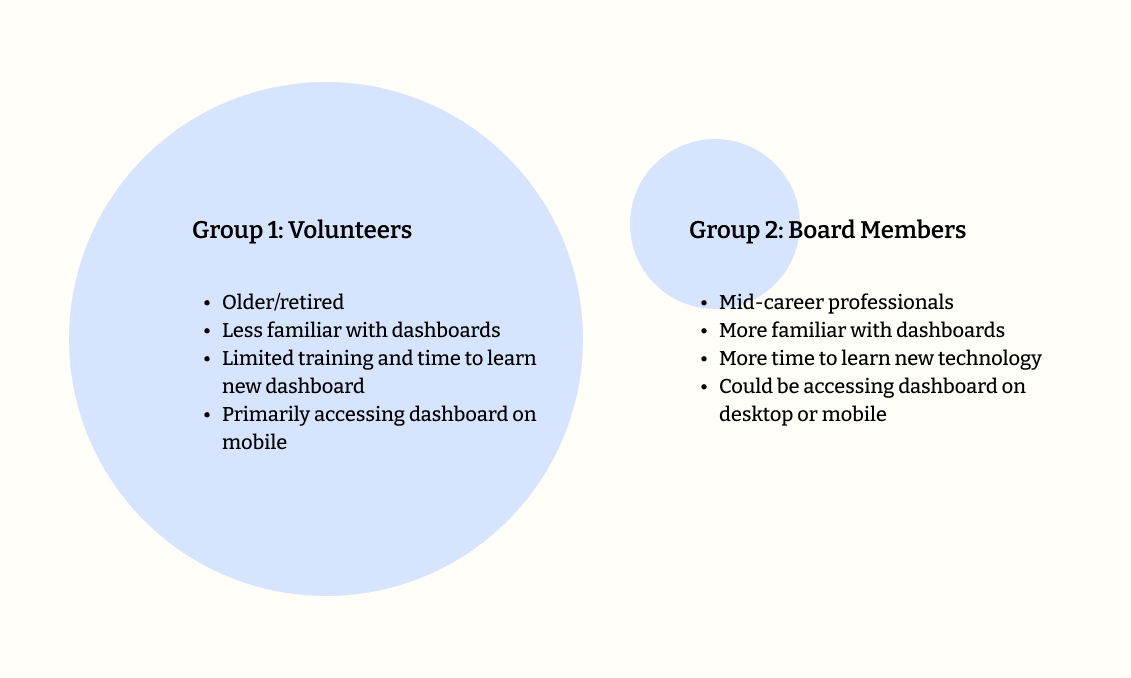
Although the dashboard would be used by both groups, the larger share of users were Group 1. The dashboard's content and architecture needed to make intuitive sense to them.
Question: How might we help FoDL volunteers and board members update supporter records in a more efficient way? And how might we help FoDL board members easily see trends in their sales and memberships?
Answer: Through a dashboard that helps FoDL volunteers and board members update supporter records and track fundraising dollars. Features include a supporter list, supporter tagging, filters, and a report generator.
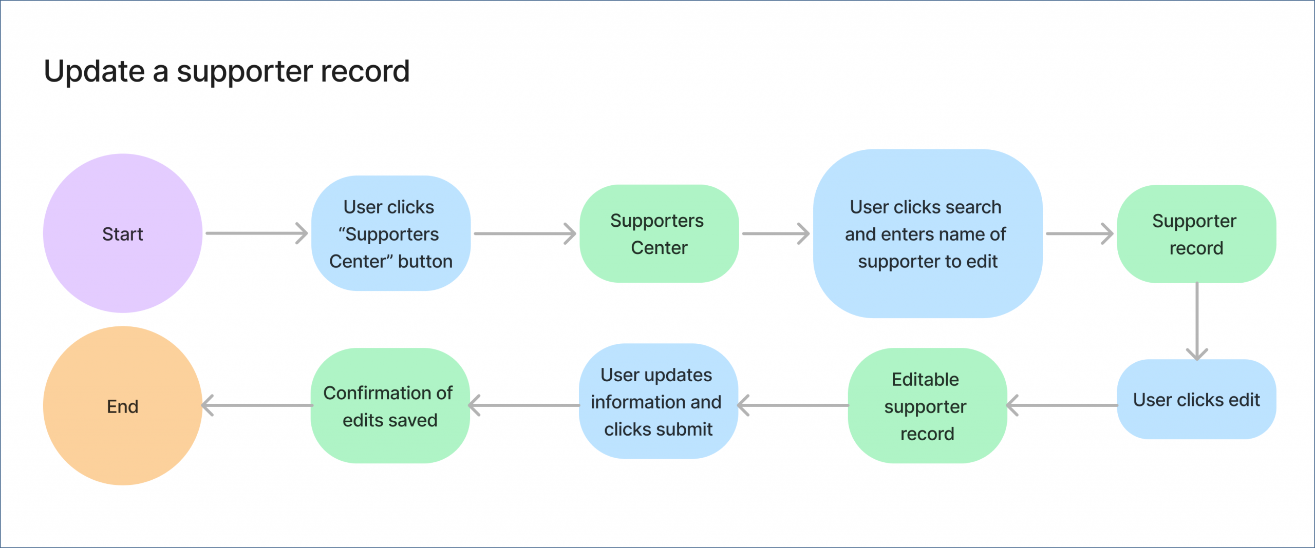
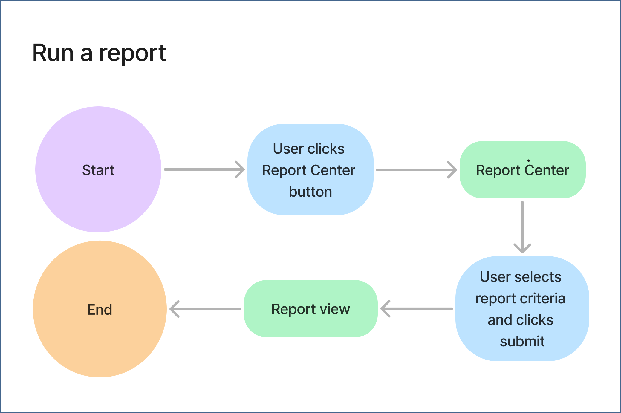
Task Flows
Before putting pen to paper, I thought through how a user might accomplish the main tasks of the website (updating a supporter record and running a report) and created task flows.
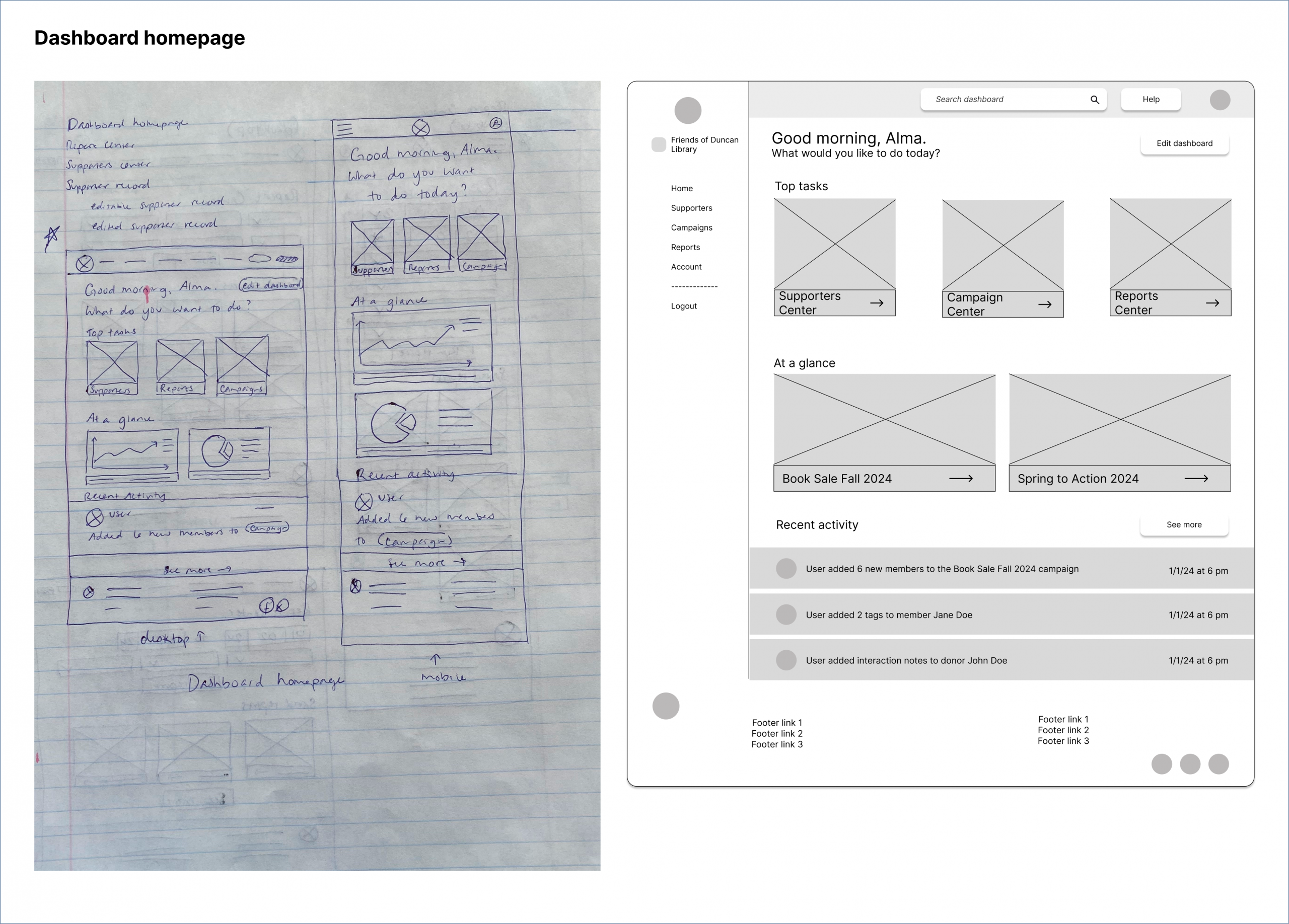
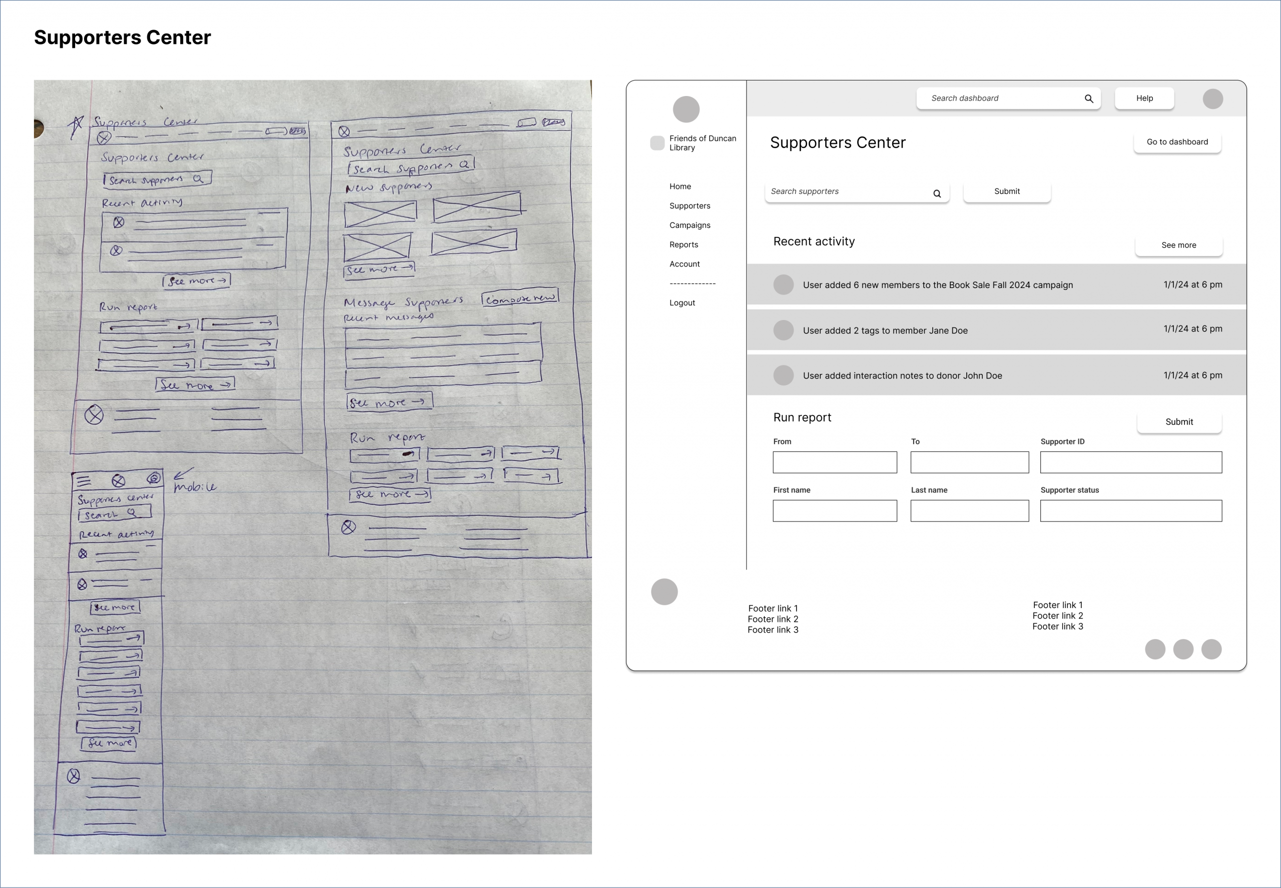
Initial Sketches and Wireframes
My primary job was to figure out how to structure a dashboard that would work equally well for a volunteer learning the tool on the fly as a board member. I designed and tested multiple variations of the dashboard.
Figma Make's AI
I also used Figma Make to create a prototype of the Supporters page, to see how AI would design the same dashboard. The end result looks much like the wireframes I created prior to using Figma Make.
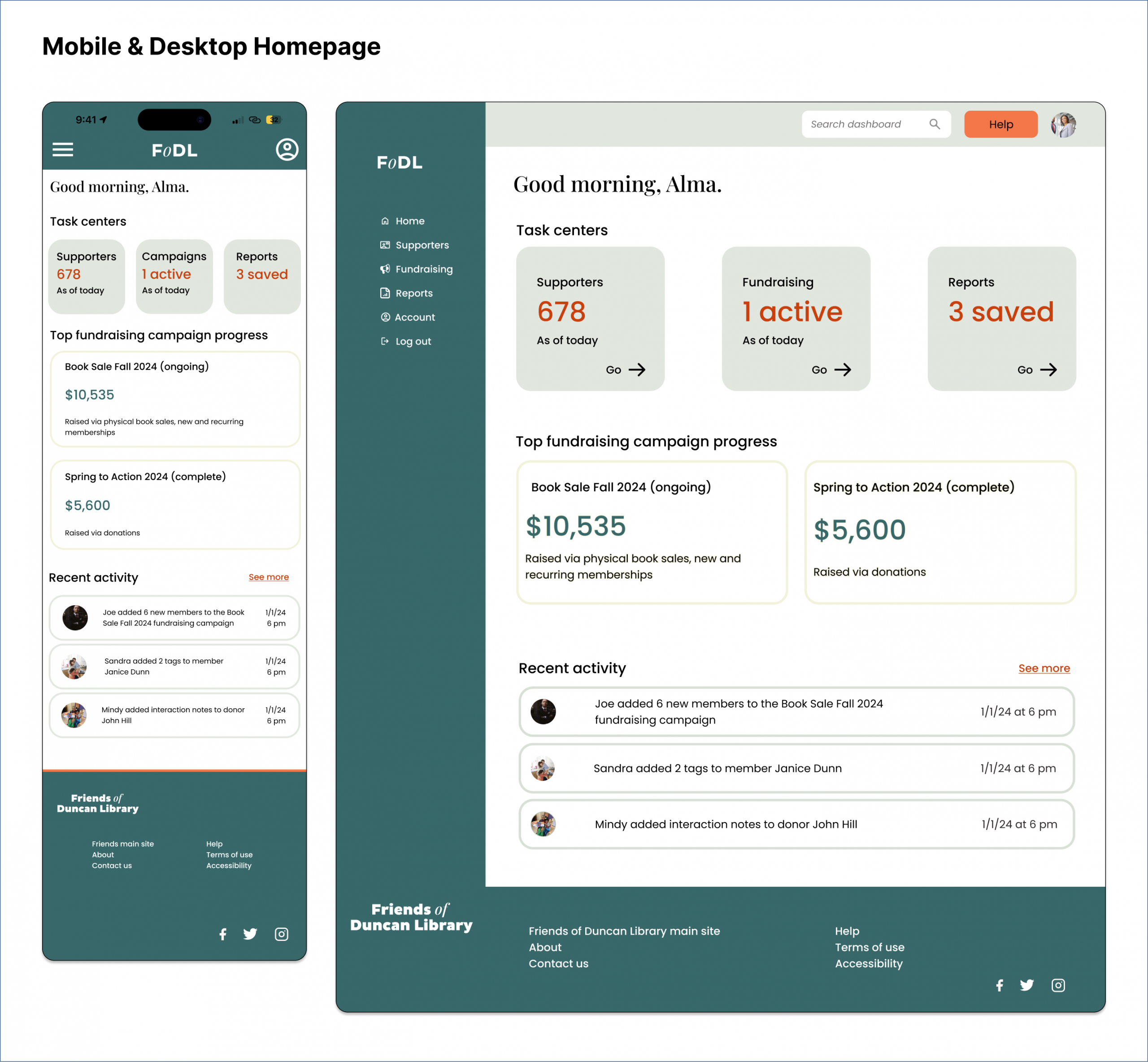
High-Fidelity Mock-Ups
The overall design was based on conventions of existing dashboards that I looked at during the competitive analysis stage.
Designing a mobile version of the dashboard was also crucial because so many of the users would be accessing it on their phones. I focused on adapting essential functions to a smaller screen by thinking about how users would use the website on the go.
Prototypes & Testing
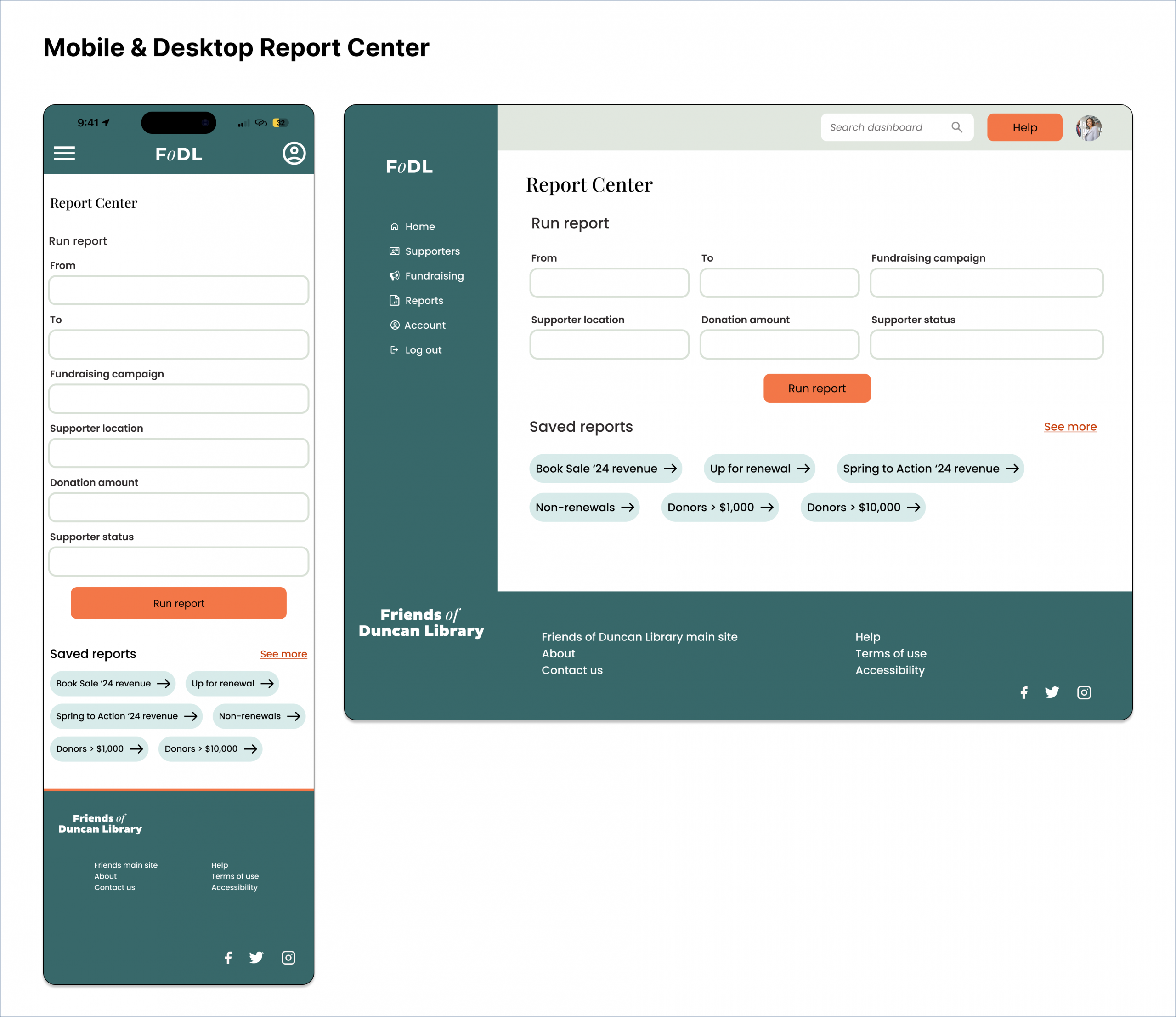
In a low-fidelity usability study, 5 users completed both task flows quickly. Running a report confused users because the task flow did not match their mental model. Several tried to run a report through the Supporters Center.
The following were user-flagged issues and the resulting changes:
- Adopting clearer, more descriptive labeling.
- Making the edit button on the supporter page clearer.
- Varying supporter names in the “recent activity” sections.
After making these changes and applying the UI kit, I created high-fidelity prototypes for each task and retested them with participants.
Design Iterations
After synthesizing the research results and feedback, I made changes to both the desktop and mobile versions.
Changes included:
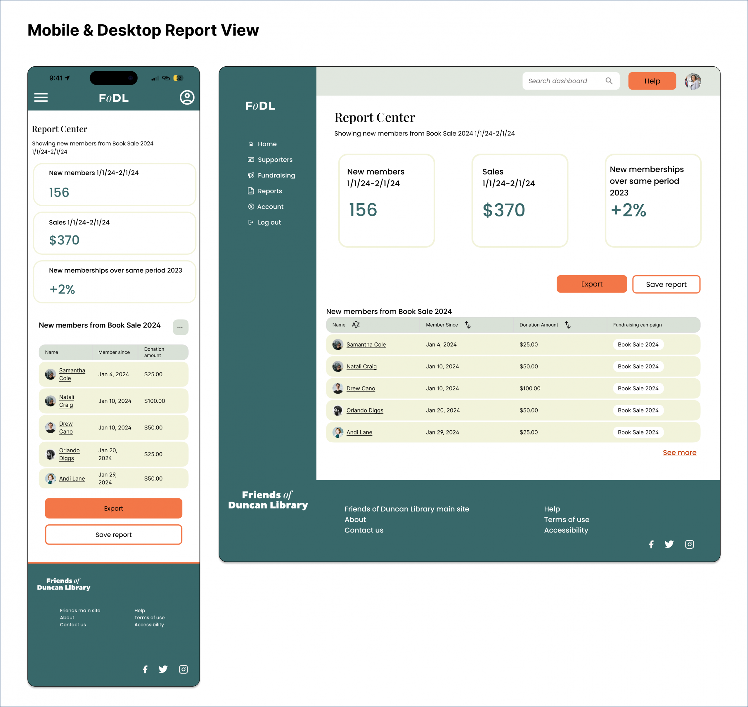
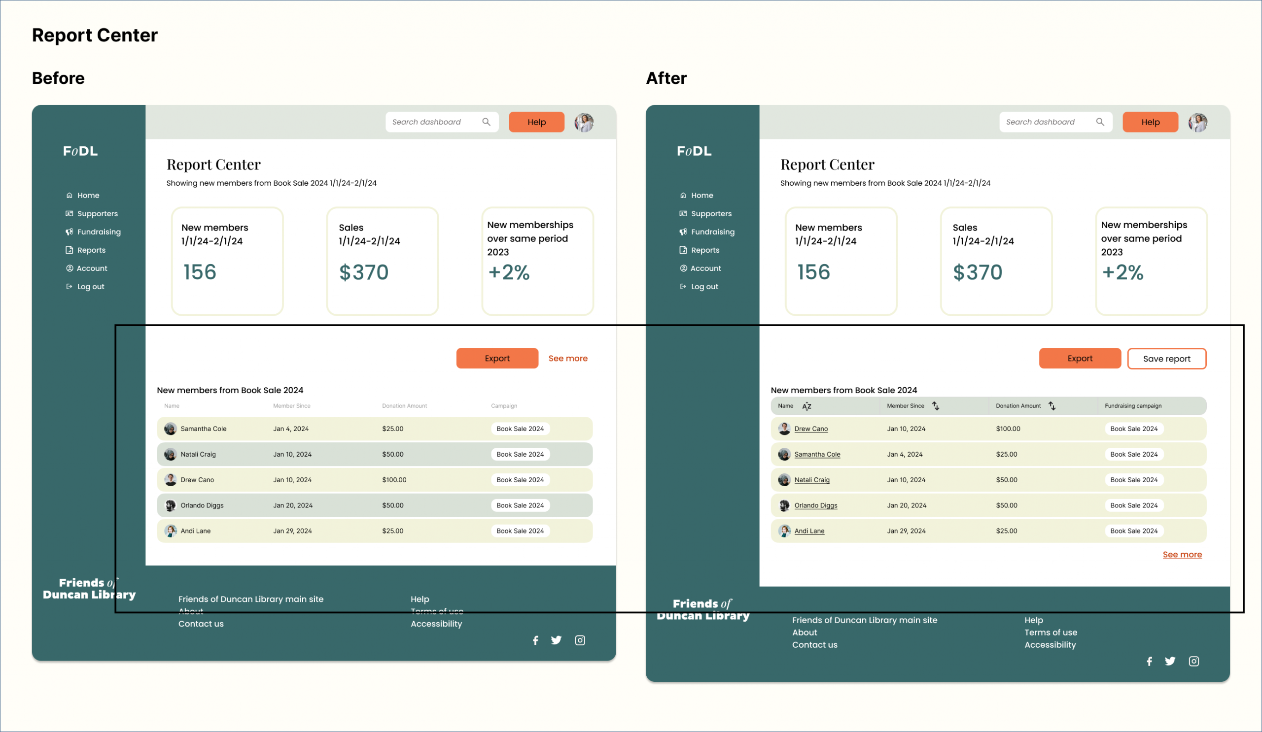
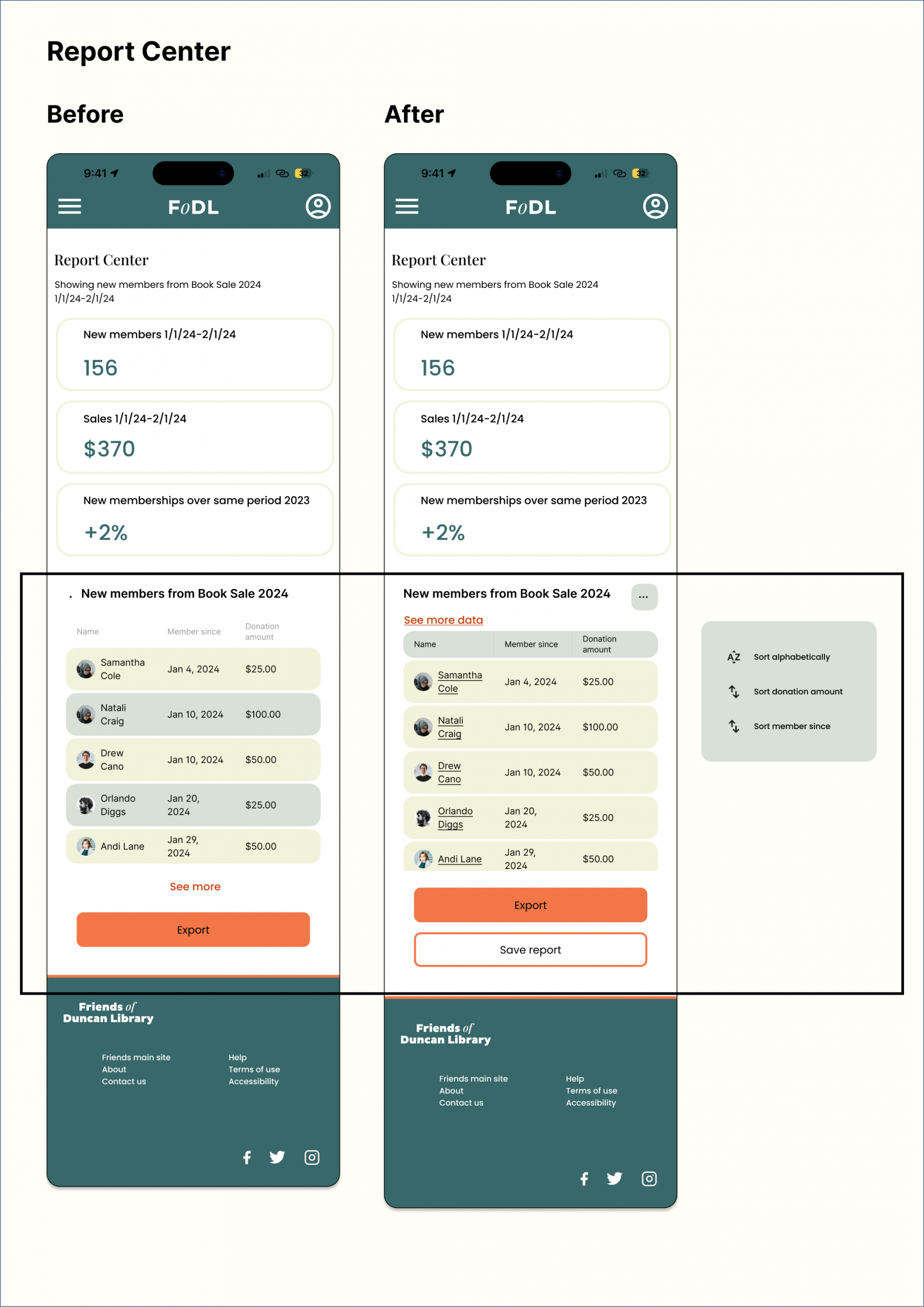
- On the Report Center: Adding functionalities, options, and a fly-out menu to standardize the table design; linked names to profiles.
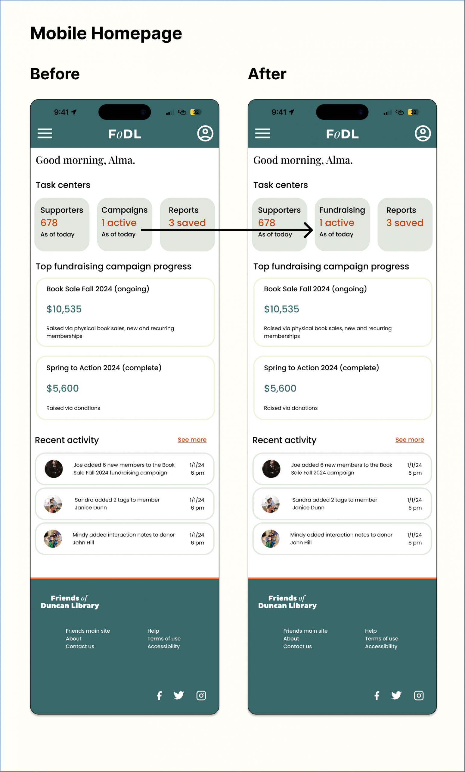
- On the mobile and desktop homepages: Retitled “Campaign Center” “Fundraising” to avoid marketing jargon.
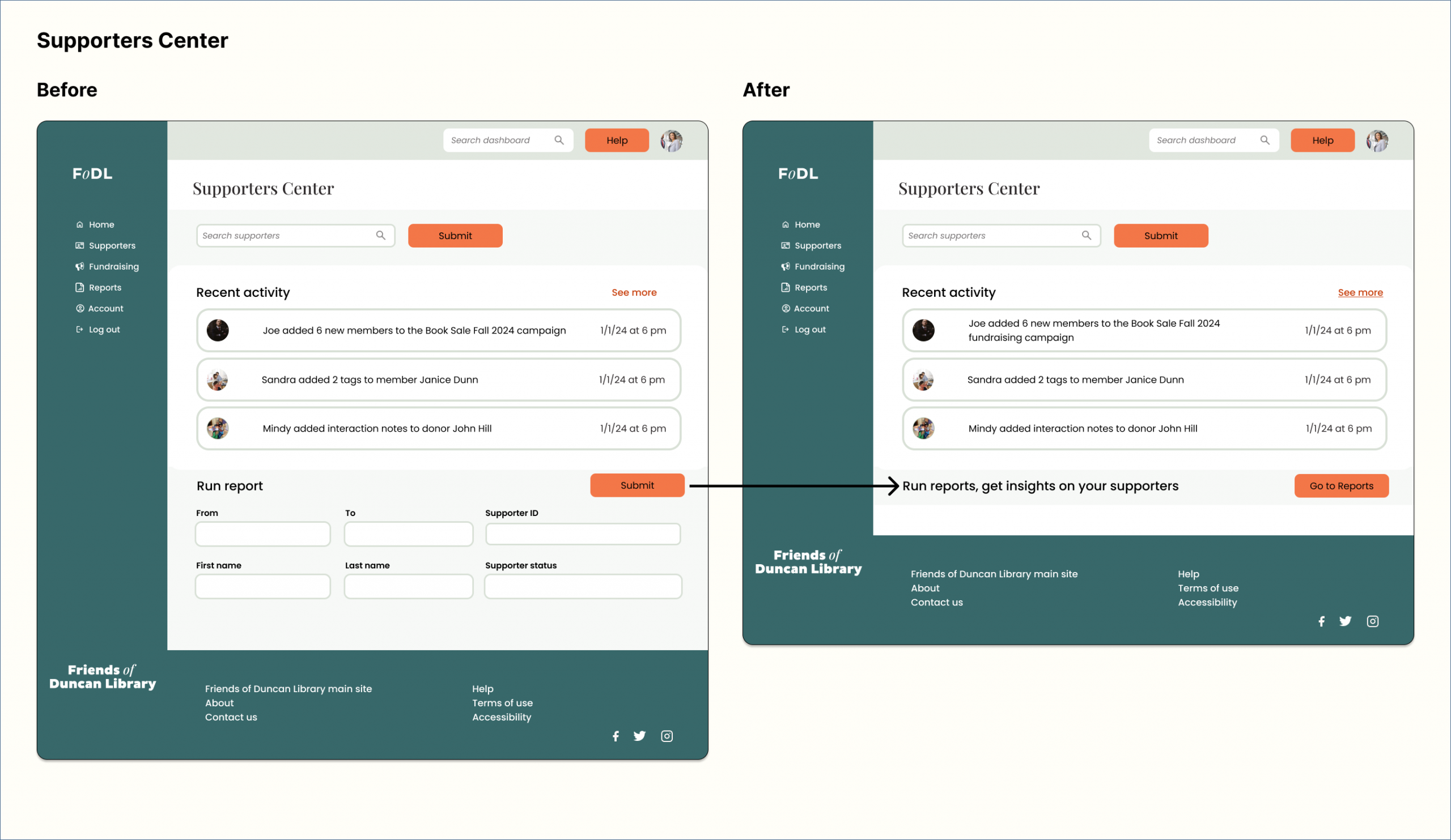
- On the Supporters Center: Added a redirect for people who went to the Supporters Center to run a report.
Impact and Reflection
If adopted by FoDL, the dashboard should increase conversions (from book sale attendees to donors) and increase operational efficiency (by making it easier to manage donors effectively and accurately forcast organizational funding).
In designing this dashboard, I learned to distill a nonprofit's technology needs into the most effective and cost-effective solution. For FoDL, I created a tool to support member and donor relationships and track finances.
I also learned the importance of adapting the design to meet users’ mental models. I designed the wireframes based on existing dashboards, all of which had separate sections for running reports. What I didn’t realize was that users might navigate to the section of what they need to run a report on instead of the dedicated report section. More testing is needed to determine if the changes made to the designs will result in shorter task completion rates.
