Simplecycle
A mobile app that helps users determine what can be recycled where they live.
Role: UX Researcher/UX Designer
Goal: Develop an MVP within 3 months
Tools: Figma, Miro
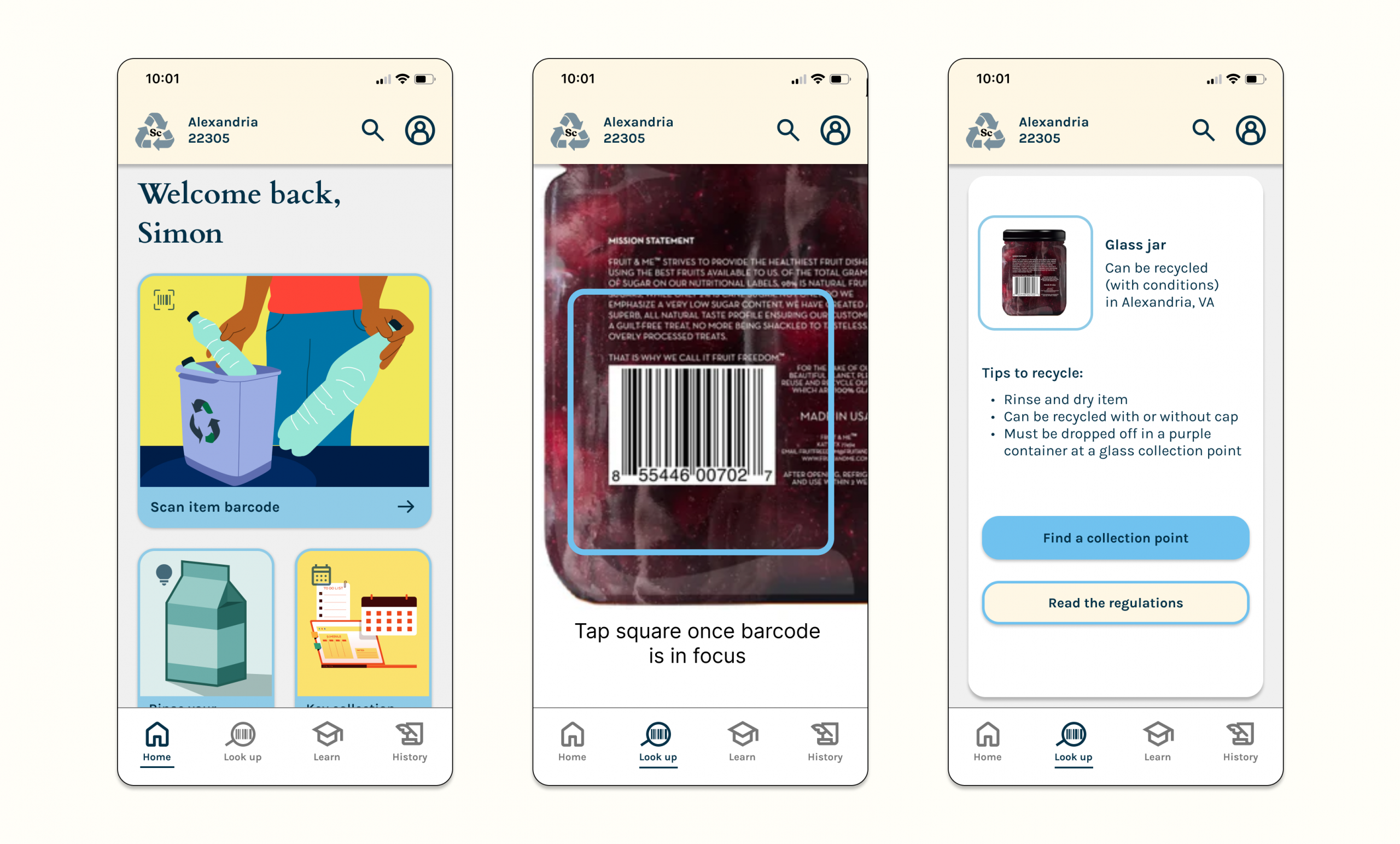
Simplecycle
A mobile app that helps users determine what can be recycled where they live.
Role: UX Researcher/UX Designer
Goal: Develop an MVP within 3 months
Tools: Figma, Miro

Overview
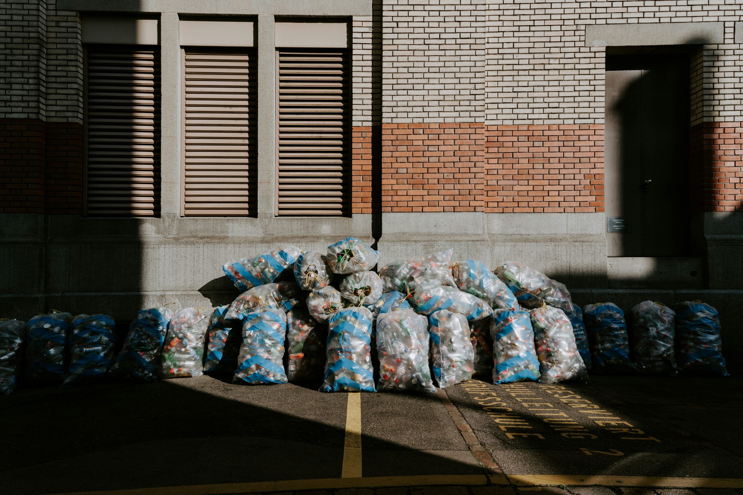
Inundated with alarming news about the environment, many people are eager to take action. How can we support them in living more sustainable lives, starting with the responsible disposal of used items?
The Problem: Recycling guidance is often inconsistent and confusing, and the steps recommended by environmental leaders can feel overwhelming.
The Solution: Simplecycle is an app that helps users make sense of complex recycling rules in their area. It informs users whether—and how—an item can be recycled locally.
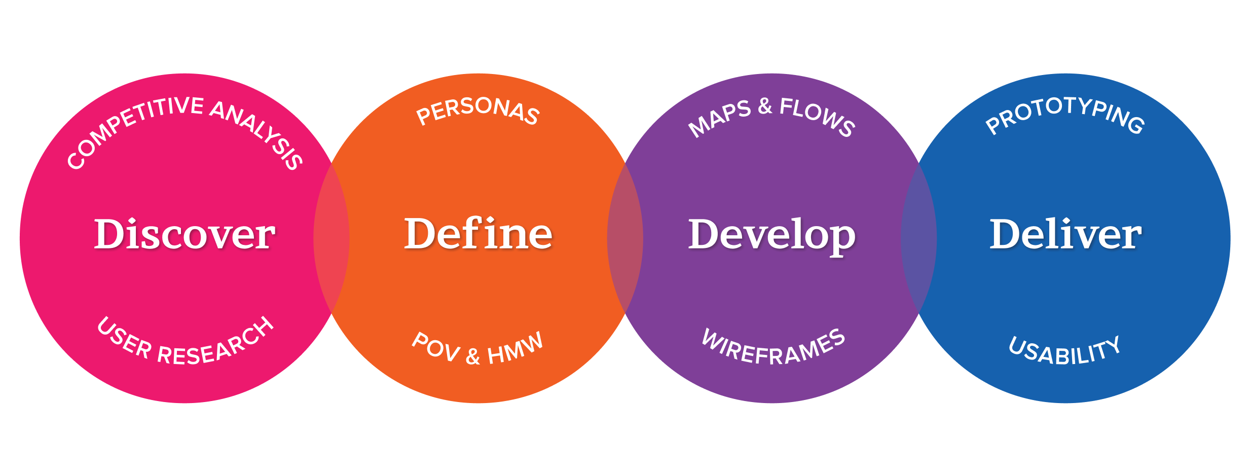
My process is simple and methodical.
I followed up on conversations with actual users of similar apps, identifying their pain points and goals.
Then, I gathered and synthesized the data into actionable insights that informed the next stage of the process.
Customer Research Results
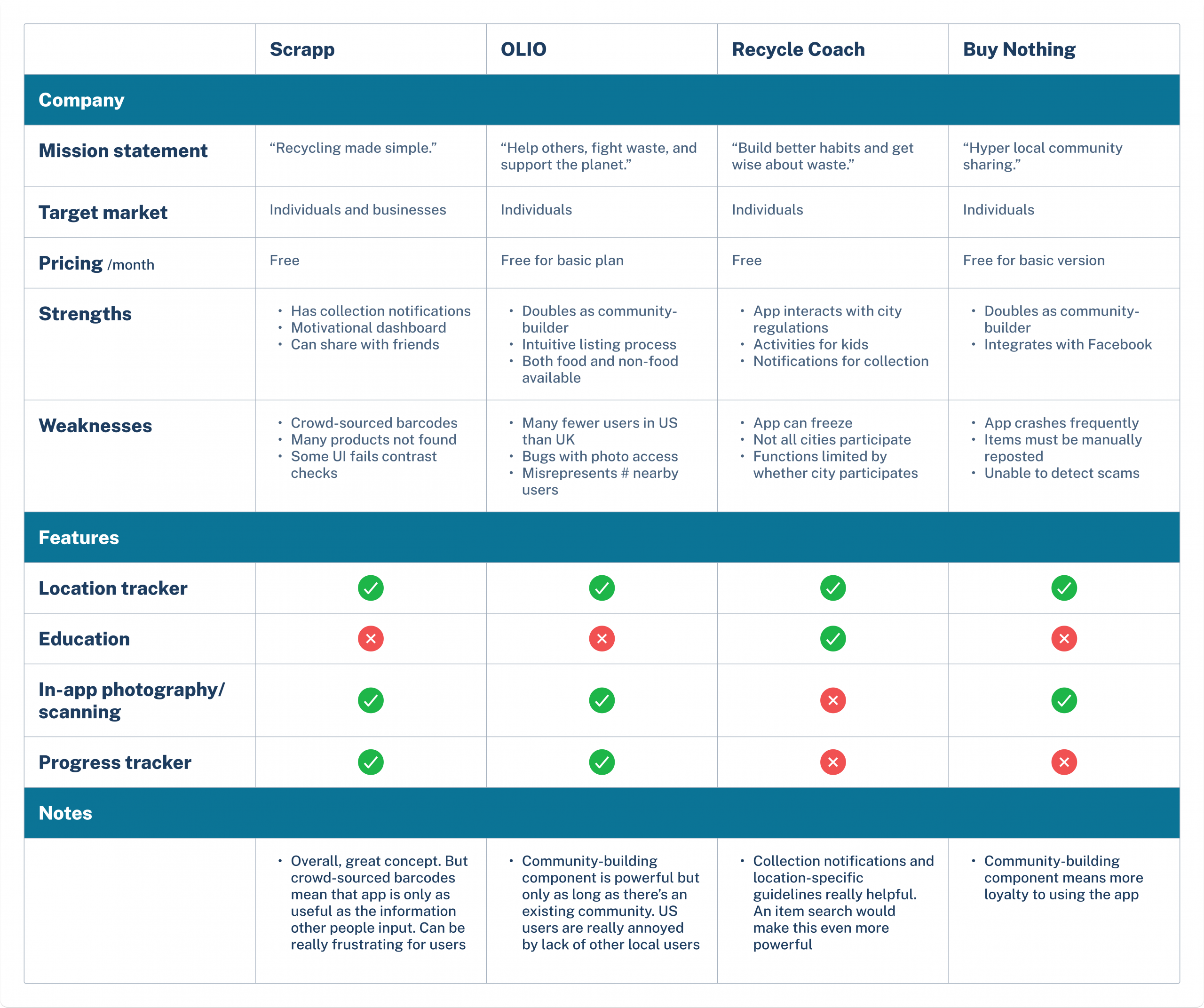
I looked at secondhand marketplace/gifting apps and recycling apps to learn more about how eco-conscious people use technology to support their goal.
The most valuable features for users were an education component, camera access to scan barcodes, and location specificity to ensure recycling guidelines are accurate to the user.
I also talked to 6 adults (ages 26-40) remotely who reported using apps to reduce consumption. All were very concerned with the state of the environment. I asked them about how they use apps to try to live more sustainably and what pain points they have experienced.
My Findings
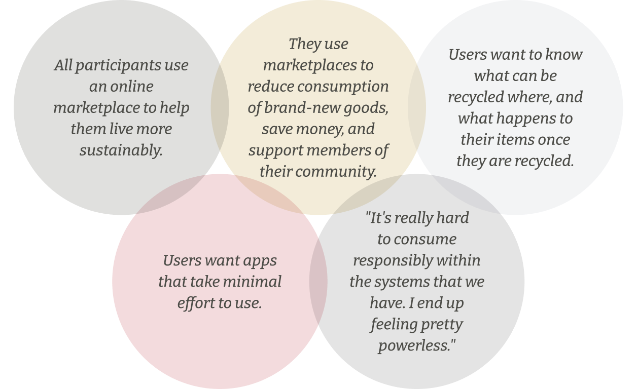
Synthesis
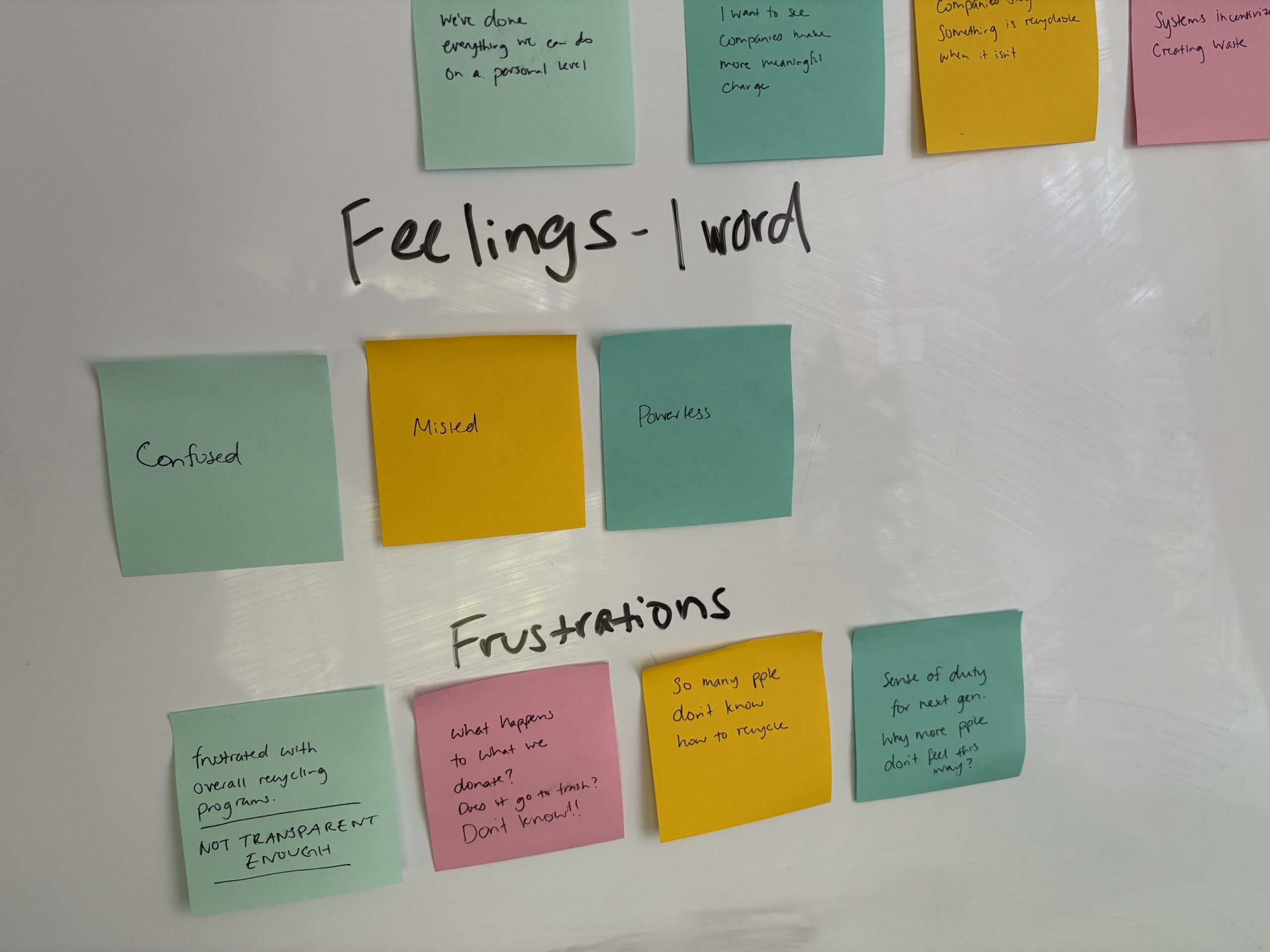
I uploaded the data gathered from user interviews into Miro and began looking for common themes.
From the themes I gathered, I observed the following:
Users feel a duty to recycle but are confused about regulations and feel that companies should be doing more.
Users want a search and idea tool to help them dispose of items better.
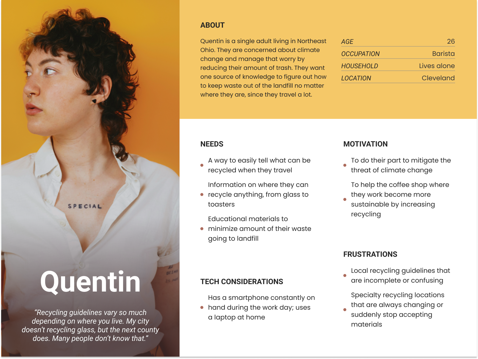
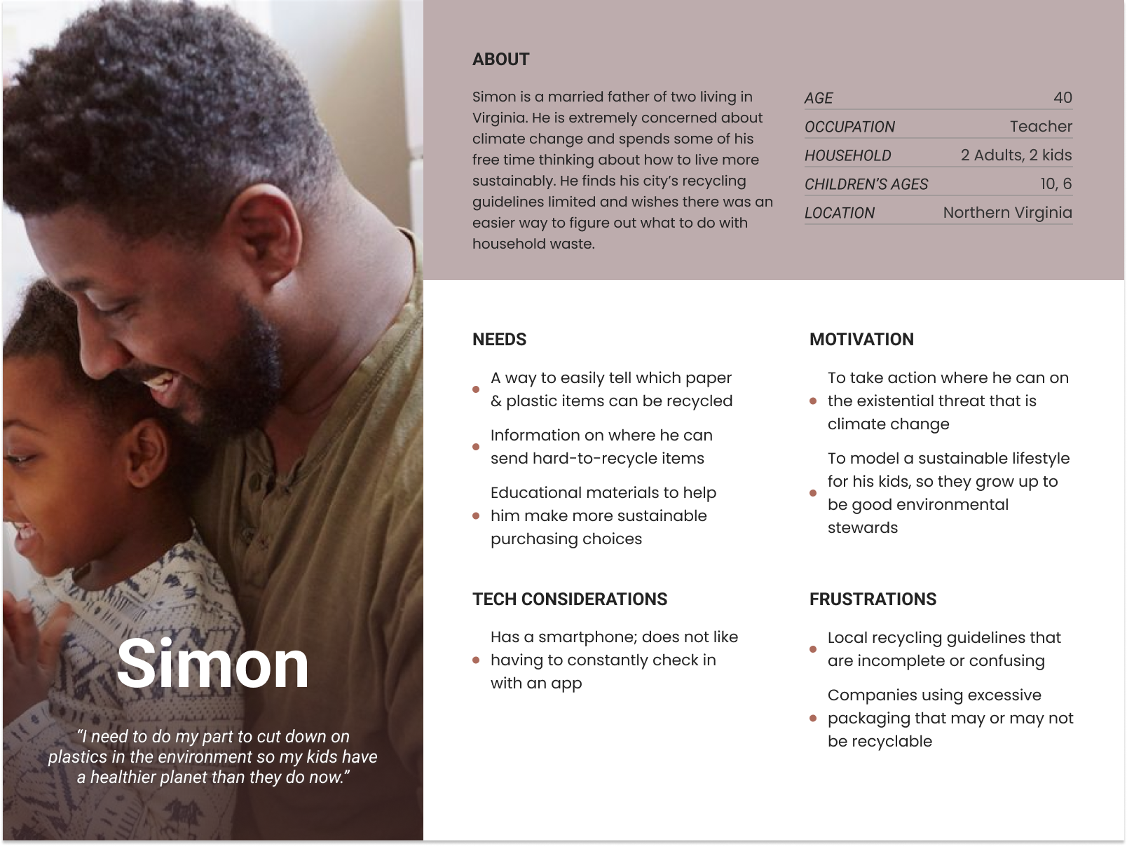
User Personas and Points of View
Like users I interviewed, Simon and Quentin are extremely concerned about the environment, want to reduce their waste, and are overwhelmed by the recycling regulations in their area.
Question
How might we help people like Simon and Quentin easily find out if their used items can be recycled?
Answer
Through an app that demystifies the local recycling process. A barcode scanner lets users quickly check how to recycle a used item. An education feature breaks down local recycling rules into easily digestible information.
Task Flows and Site Map
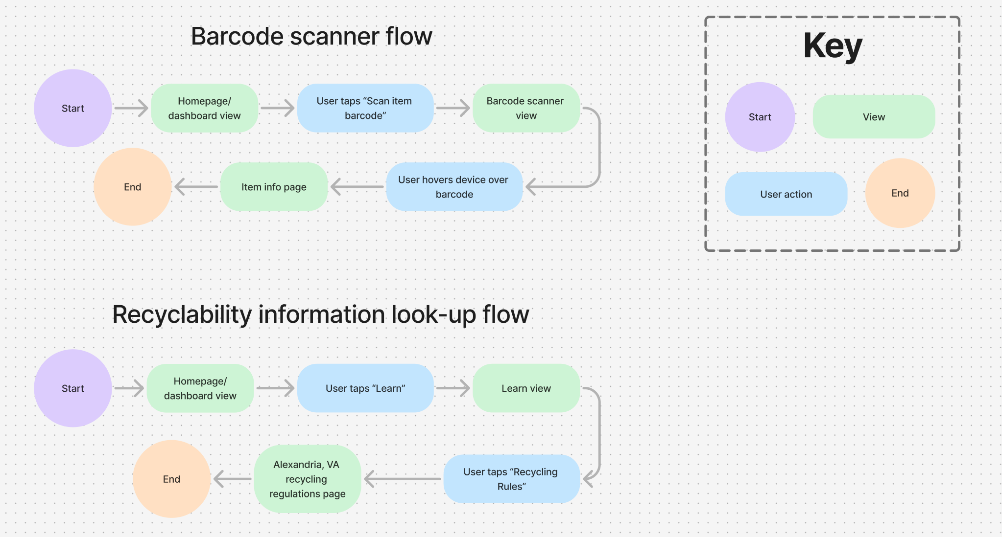
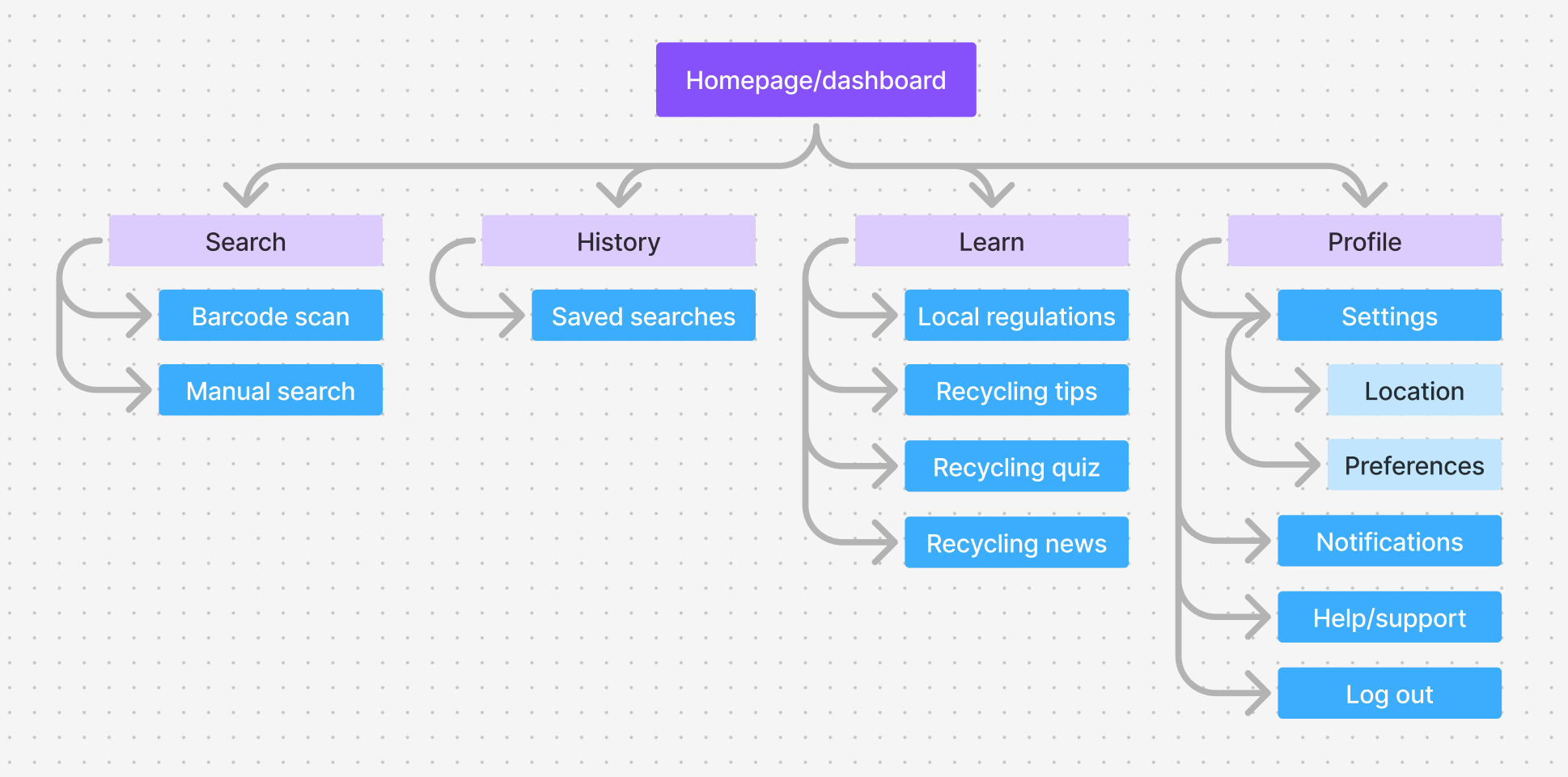
I began to think through how an app to search recyclability would work. As a starting point, I thought through how a user might accomplish the main tasks of the app (searching recyclability by item and looking up local regulations) and created a site map of necessary pages and task flows.
Initial Sketches and Wireframes
Figma Make's AI
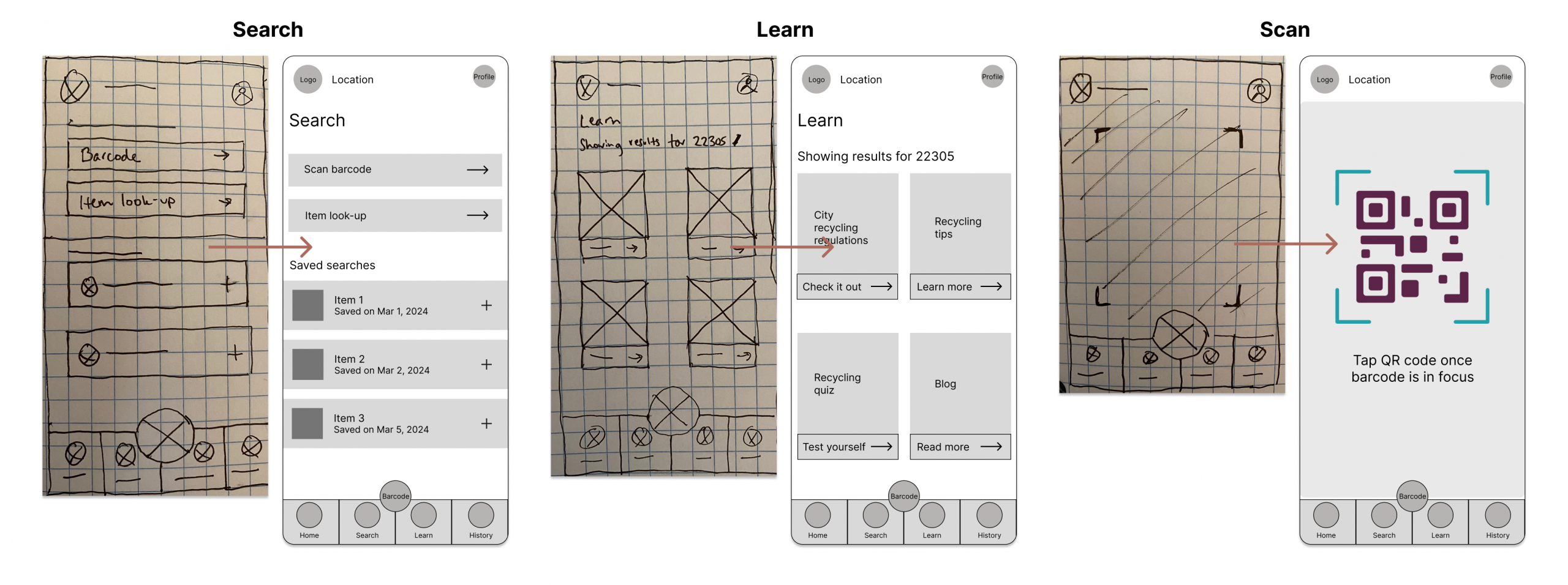
I also wanted to see how Figma Make's AI capabilities would design a screen based on my sketch, so I uploaded a view of the Search screen. The result was a somewhat functional prototype, but it lacked refinement, with too much empty space and icons that felt too small.
High-Fidelity Mock-Ups
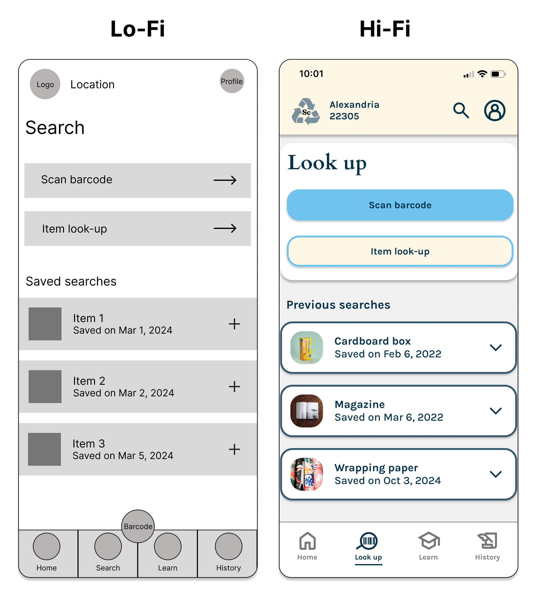
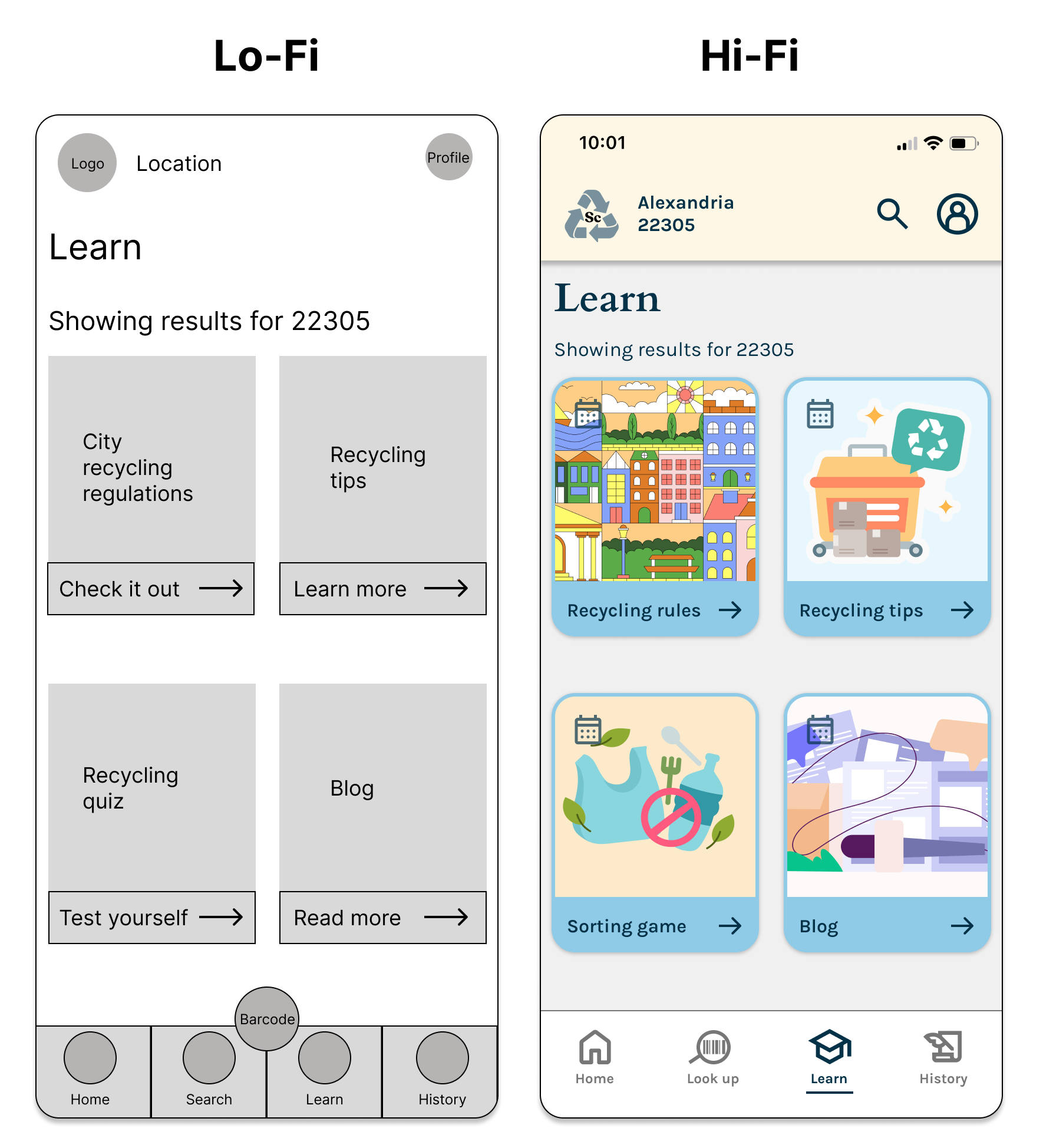
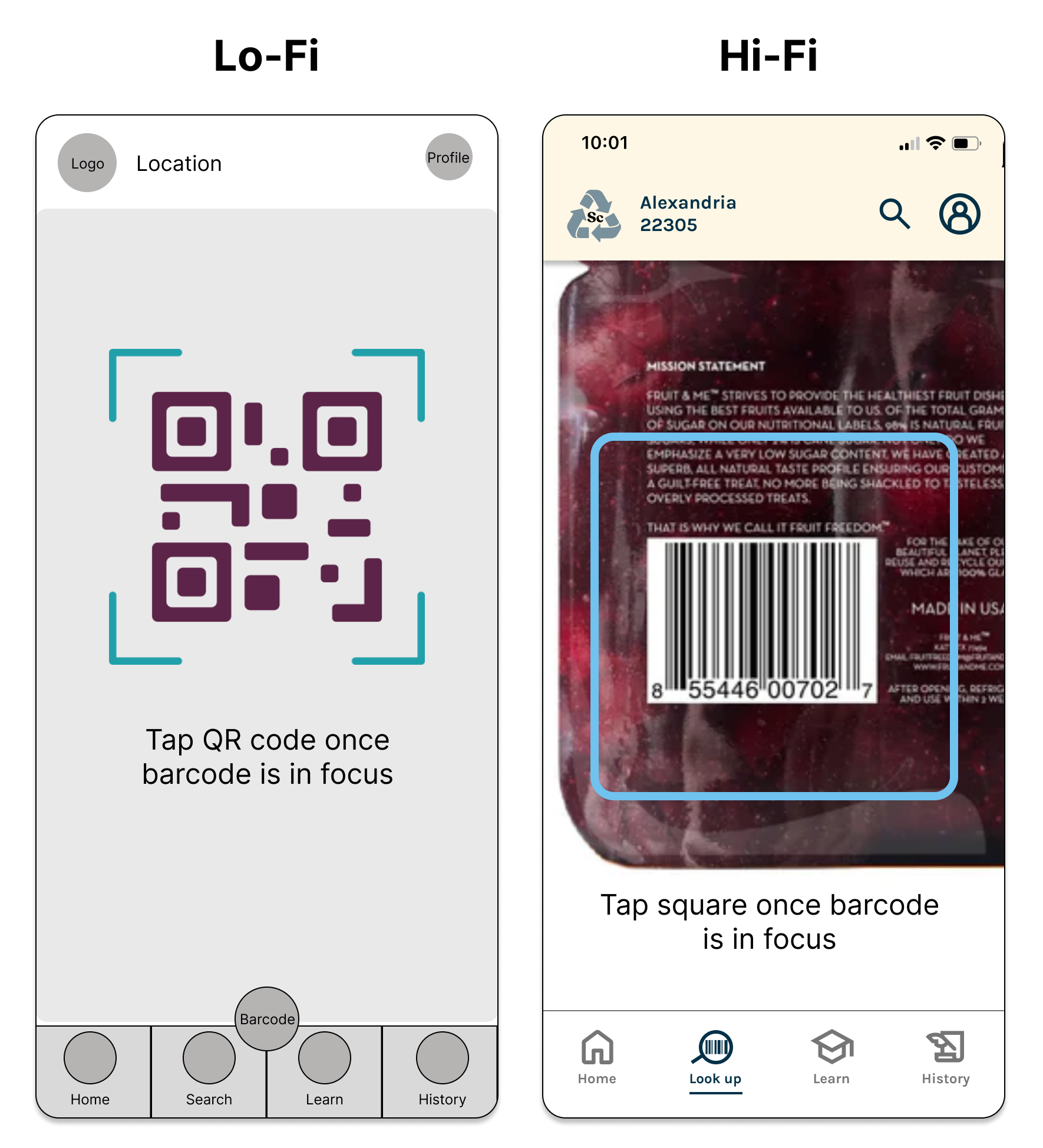
The overall design was based on a clean and approachable aesthetic to evoke optimism and clarity. I used bright illustrations and rounded edges for the cards and a color palette of shades of blue and light yellow (while ensuring that all text passed contrast tests).
Prototypes and User Testing
In a low-fidelity usability study, 5 users easily completed the two tasks. All rated the app useful, citing the barcode scanner and how recycling rules were broken down.
The following were user-flagged issues and the resulting changes:
- Retitled the homepage call to action “scan item barcode” to clarify look-up.
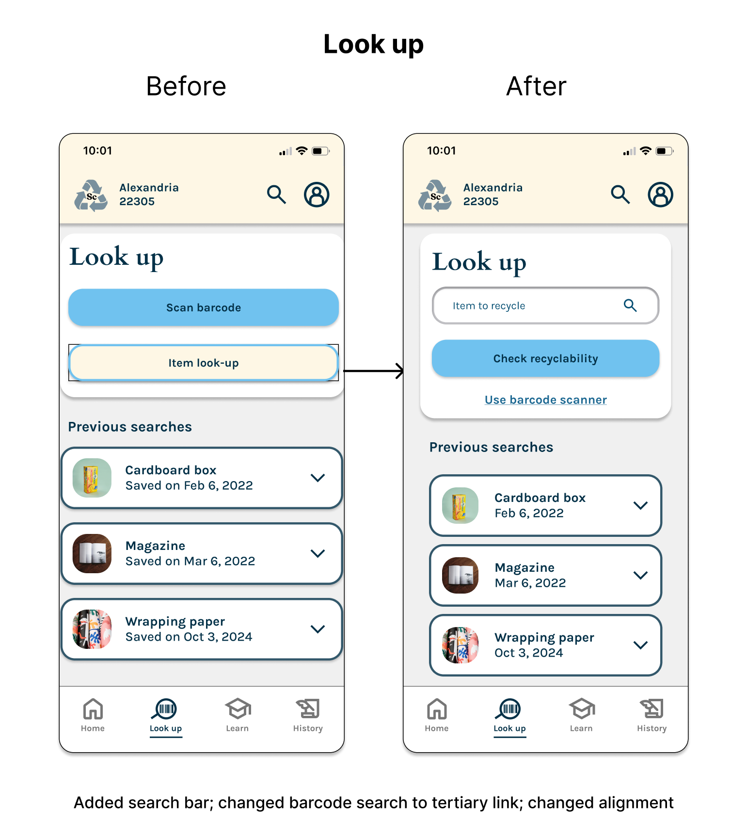
- Retitled “search” as “look up” to differentiate from the general search.
- Removed unused shortcut to barcode scanner from the bottom navigation.
After making these changes and applying the UI kit, I created high-fidelity prototypes for each task and retested them.
Design Iterations
Overall, no major changes needed to be made. All participants completed both tasks, and all rated the app as “very useful” for learning about responsible recycling.
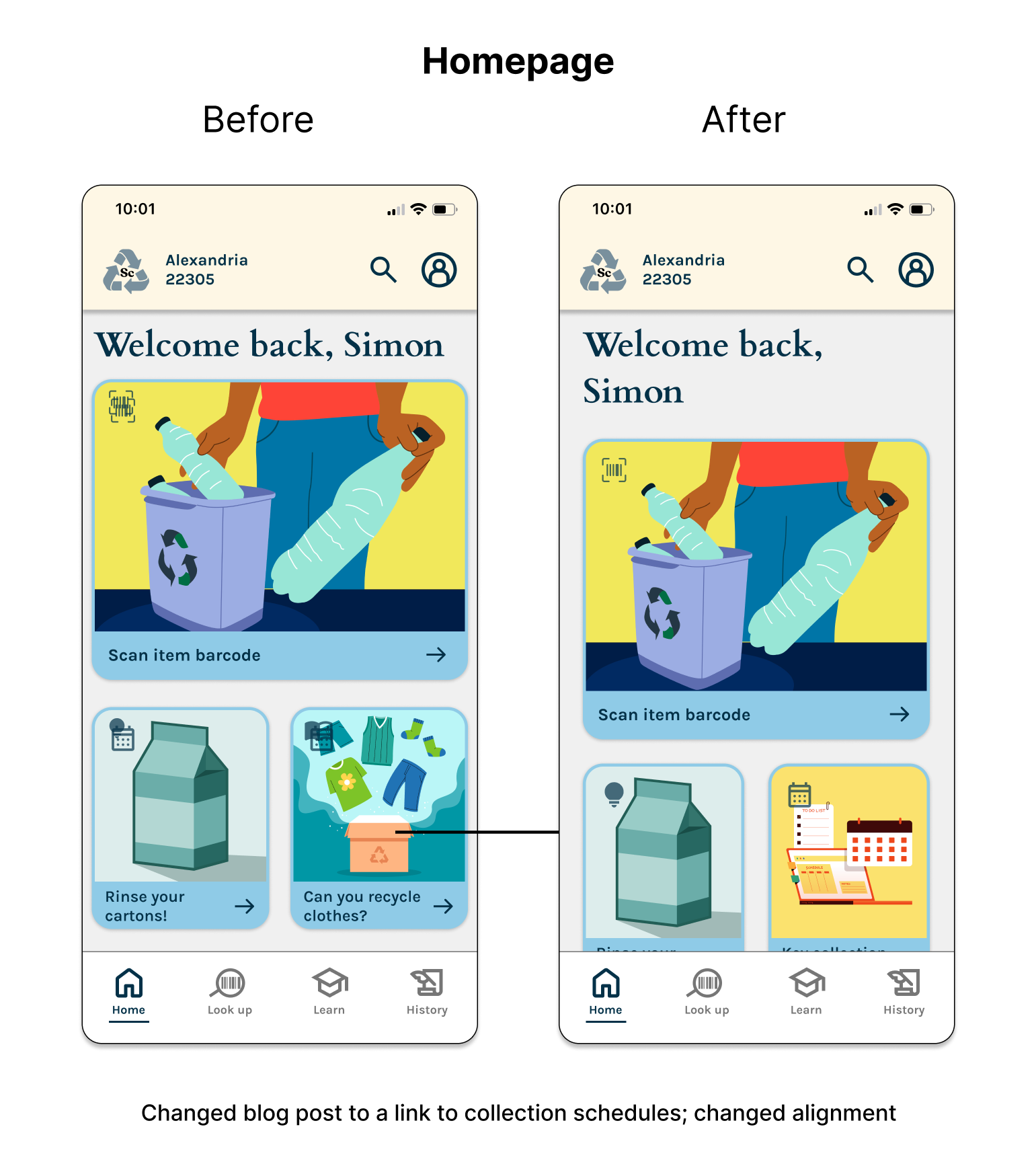
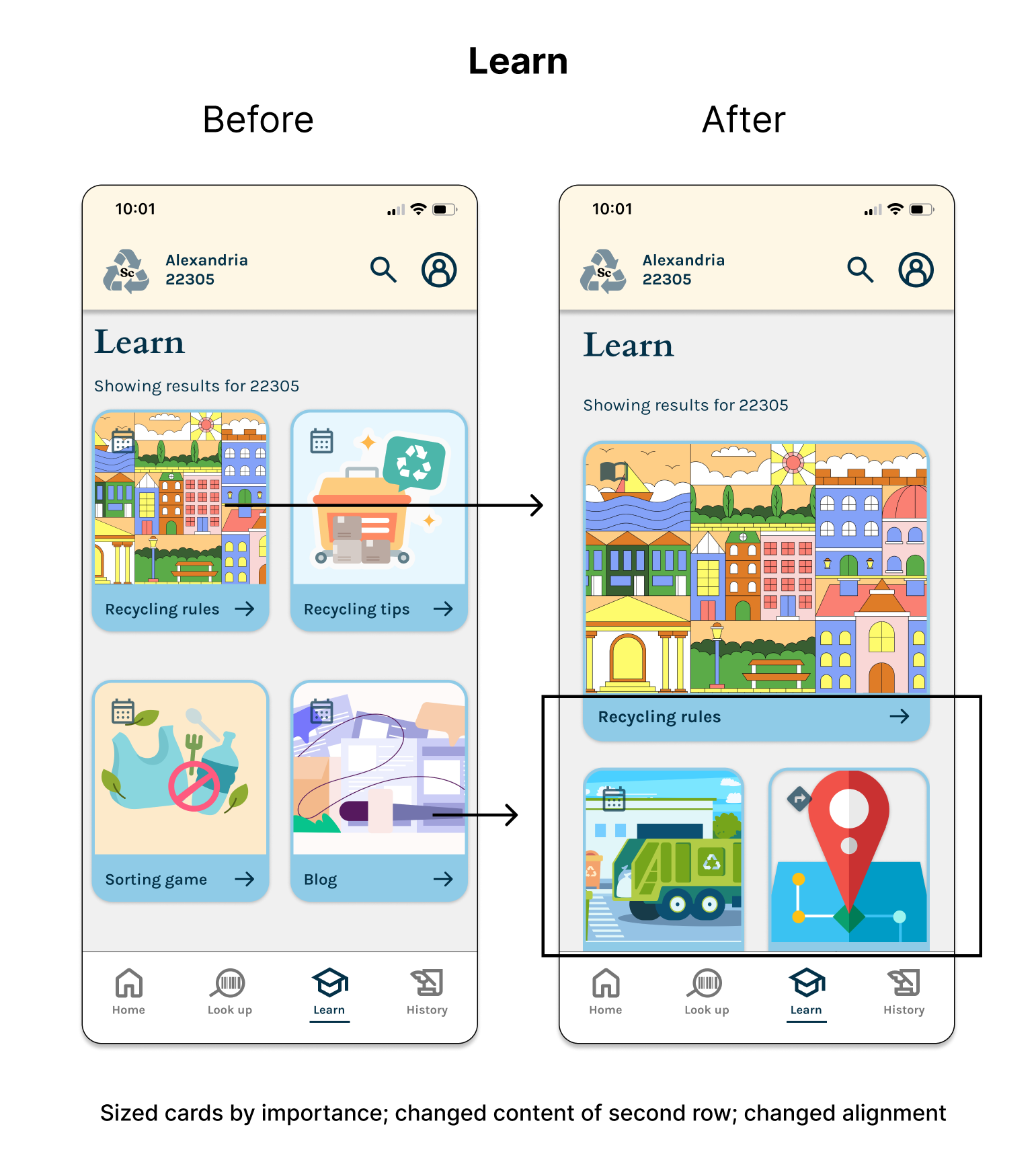
The main changes were to the content of the cards on the homepage and the Learn page:
- Varied the sizing according to importance: the “Recycling rules” card on the Learn page grew to look like “Scan item barcode” on the homepage.
- Added cards for important collection point locations and key collection dates.
Impact and Reflection
Users in the final round of testing were enthusiastic about using the app in the real world. Several said that they wanted the app immediately in order to streamline their household recycling.
It was challenging to isolate a need within the lifestyle app space and distill an idea to just the features necessary to create a minimum viable product. I suspected that the eco-conscious lifestyle space had room for further innovation, and my research revealed a need for better guidance on reducing personal waste and also a wish to encourage recycling through tracking progress and comparing with friends.
Down the road, I would add one of the other features that users requested: either a habit-building feature or a hub where users could get ideas about how to upcycle items they can't recycle. Both features would bolster user efforts toward living a more sustainable lifestyle.
Given the anxiety and guilt tied to personal recycling practices, I have begun to wonder if using the app could potentially alleviate some angst about the state of the environment. In the future, I would like to test if users report any change in their environmental anxiety after using the app for a period of time.

